#Tutorials
Zander Whitehurst
Zander posts short and fun Instagram videos about using Figma.
Figma For Beginners
New introductory videos from Figma, with four parts focused on exploring ideas, creating designs, building prototypes, and preparing files for handoff.
Figma tutorial: Masks
Figma tutorial: Auto Layout review card iterations
Figma tutorial: File Browser
Creating a design system in Figma: a practical guide
How to create futuristic interfaces in Figma
I shared one of Sebastian’s futuristic interface illustrations a few months ago, but really glad he recorded a full video tutorial with his process!
How to make dotted lines for illustrations
Come for the tip, stay for a beautiful demo.
Here is a #FigmaTip showing you how to make dotted lines for your @figmadesign illustrations. ✏️
— Mirko Santangelo (@mirkosantangelo) January 29, 2021
Open the Advanced Stroke panel, set the Cap to Round, then add a 0.1 Dash and tweak the dots spacing using Gap.
Happy Friday! ☺️ pic.twitter.com/M5NomG6VLU
Illustration tutorial: Create an eye in Figma
Martin Bekerman is a Brand Design Lead at Netflix and a fantastic illustrator. See some of his recent artworks in the next section.
How to make complex interactive buttons in Figma in 3 steps
A tutorial on creating complex interactive buttons in Figma. This is a follow-up to the article How to Make Simple Interactive Buttons in Figma in 2 Steps, which demonstrated a more basic approach.
Figma for Non-designers
Two Dropbox employees joined forces to create an internal Figma workshop for all design-adjacent roles in the company. This blog post tells how the project came together and shares their slides as a Community resource.
Figma Snacks
Playlist of 15 short 20-second videos about Figma by Pablo Stanley.
Figma Tutorials for Beginners
Figma Tutorial: Easing Curves
Build It in Figma: Create a Design System — Components
Figma Tutorial: Prototyping & Transitions
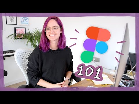
Figma 101: An Introduction Tutorial
This tutorial by Charli Marie shows the basics of Figma — how it works, how to use it, and some tips and tricks to get the most out of it while you’re getting started.


