File templates. Improvements to Styles. Figma for non-designers.
Time to ship new features after a winter break! During the last couple of weeks, Figma released multiple updates and improvements. File templates may be the most noticeable one, but personally, I’m more excited about improvements to Styles. A way to review library updates before accepting them is a nice touch too! Also in this issue, check out how non-designers use Figma at Dropbox, how teams use Zeplin for developer handoff, and even how to organize your design system with Notion. Enjoy!
— Eugene
Promo
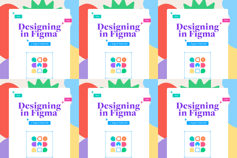
Book “Designing in Figma”
My practical guide to Figma, showing how to create layouts that will evolve over time, build design systems at scale, and stay organized and efficient in the process.
App Updates
Get started faster with new file templates
When creating a new Figma file, you can now choose from a selection of common presets and Community templates to get started. (I first wrote about templates back in July of 2020, but then it was only a limited trial.)
New co-editor experience, style improvements, and Asana integration
Multiple updates in a single release. First, Styles can now be reordered, grouped together, and opened in a floating window. Second, you can add co-creators to your public Community files and plugins. And last, Figma files can be embedded in Asana’s project overview.
Library description and file template improvements
“If you’ve added a description when publishing changes to your team library, your collaborators will now be able to see your notes as they review the updates.” Also, Figma Organization Admins can now turn templates off for their organization.
What’s New
Figma for Non-designers
Two Dropbox employees joined forces to create an internal Figma workshop for all design-adjacent roles in the company. This blog post tells how the project came together and shares their slides as a Community resource.
Force Mobile Design System
Warren Tobias describes the whole process of developing a proper design system and replacing Sketch, Abstract, and Flinto with Figma. Interestingly, they continued using Zeplin for the handoff process as their development and engineering team is mostly outsourced.
Figma and Zeplin: The optimal workflow at ArcTouch
Speaking of Zeplin, this is a pretty good overview of how a digital agency ArcTouch uses it together with Figma.
Using Figma
The UX of Illustrating my way to Figma
An overview of tools for converting Adobe Illustrator files to Figma. Based on this test, XD2Sketch works the best and has a comprehensive set of converters between popular design tools (the name is misleading), but their price is steep.
How to make complex interactive buttons in Figma in 3 steps
A tutorial on creating complex interactive buttons in Figma. This is a follow-up to the article How to Make Simple Interactive Buttons in Figma in 2 Steps, which demonstrated a more basic approach.
Demo of Variable-Width Stroke plugin
Figma55 recorded a short demo of the recently released plugin by Figma cofounder Evan Wallace.
Use CSS color names in Figma
A quick tip from Figma Designer Advocate Anthony DiSpezio. (While on topic, read the story behind color named “rebeccapurple”.)
Use variants and icon instances with preserved colors
Great trick on using Union to preserve the color of icons.
Stylistic alternatives for glyphs
Miguel Cardona on using OpenType features.
Figma in 5: Tricks on Fire II
Rogie with another collection of hot tips and tricks.
Build a Design System with Figma and Notion
A nice way to organize a design system and plan work using Figma embeds in Notion.
Figma vs Adobe XD vs Sketch 2021
Mizko shares his opinion along with votes from 913 designers on the best design tools in 2021.
Made in Figma
Yvette Young Illustration
Cool artwork by Joey Lamelas. Don’t miss his process shared on Twitter.
Resources
Figma Comments on Mobile
A new 3rd-party app for commenting on Figma files from your phone.
UI2: Figma’s Design System
What a gem! “This file contains the Figma design language and system. It includes the styles, components, and variants Figma’s design team uses everyday to design Figma itself, as well as some instructions and best practices.”
Shopify Polaris for Admin Web UI
Polaris for Admin Web UI kit is focused on building and creating products for Shopify.
Presentation Template
Presentation template featuring ‘Stuck at Home’ illustrations by Blush.
Microsoft Fluent System Icons
The team at Microsoft published a v2 of the Fluent System Icons toolkit. New sizes are available, with over 4.5k icons per theme. The new icons are built with Variants, friendlier, have rounded corners and simplified shapes.
Plugins
 Image Tracer
Image Tracer traces black and white bitmap images and turns them into a vector layer.
 Warp It
A simple plugin that allows you to warp, bend, and distort vector shapes.

