#Components & Variants
Rethinking my components with slots
Rachel from Figma’s Show Your Work series walks through her file and breaks down three categories where slots reshaped her system: repeating elements like menus and tabs (where she keeps nested subcomponents as default content so system-level edits still propagate), free-form areas like sheets and modals (where she often ships zero default content because designers just delete it anyway), and experimental page-level templates that “start to feel a lot more like code.”
Sharper controls for every slot
Slots in Figma Design just got a set of guardrails: min/max layer counts, instance restrictions to limit what can go inside a slot, an empty-slot default so slots stay visible on canvas, and auto-fill behavior. Slots are now generally available, and these controls make them genuinely safe to use at scale.
Swap Instance vs. Slots
Off the back of the Slots livestream last week with @dotdude, i've been trying to find a way to better articulate the distinction between Swap Instance vs. Slots.
— Hugo Raymond (@shallowveneer) April 13, 2026
They can often look like they solve the same problem, when they don't. Here's some thoughts one how to tell them…
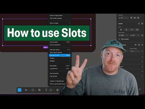
Create flexible components with Slots
Slots are finally here! This hands-on tutorial explains building flexible components with Slots and covers the practical workflow, from setting up a slot inside a component to configuring preferred instances so designers know exactly what content belongs there.
It’s time to pay respect to the original “slot component” technique, shared by Ridd back in 2021. Thanks for your service, you’ve served us well.

Getting started with Slots
How to Supercharge your Design System with Slots
 Component to do list
Luis made an incredibly useful widget to help check off requirements before the component gets to production — states, accessibility, documentation, tokens, etc. Checklists are an underrated tool for optimizing routine tasks, and I’m looking forward to trying this one. (Design Systems Checklist is another great resource worth checking out.)
A Debug mode for Figma: Making design systems usage visible without plugins
A smart technique for debugging design system usage that will nicely complement the new Check designs linter: “I wanted to see which parts of my designs were using tokens and components from my design system, just by looking at the canvas. The solution: an additional variable mode paired with an outline component. Toggle it on, and everything using the system lights up: tokens in bright cyan, components with dashed outlines. Everything else stays unchanged.”
Encourage component experimentation in Figma with “staging” libraries
Luis explores a few approaches for handling components used in multiple design files but not yet ready for the main library. Delaying the creation of components until later doesn’t scale. Using naming conventions and canvas organization to separate local components doesn’t help with bringing them to another file. The best solution is to create Staging Libraries, “where your specific team, feature, squad, whatever can create what is in effect an extension of the system for your specific piece of work.” When the component needs to be used across multiple files, it can be pushed from the local level to the Staging library, and once it’s ready to become a part of the design system, it can be moved to the Global library.
Slots
It’s wild how long it takes to build some of these larger features. Jacob Miller, a Product Manager for the Design Systems and AI team at Figma, shares an early exploration for slots from 3 years ago! I’ve been begging Jacob for slots at this year’s Config and got a feeling that they’re already working on it, but still it will be launched only next year.
If you wonder why it’s taking so long, Jacob wrote an insightful reply on how his team approaches these changes: “With design systems features, we have to plan them years in advance. Things like components, variables, and styles are used on the order of billions — one wrong move will result in breaking files and ruining critical design work. We have to be methodical. […] With DS features, I’m usually planning them around 3 years in advance.”
If you’re curious how slots and other new features will work, check out Jacob’s AMA.
I can't tell you how excited I am about Slots being announced today. The team did an amazing job and they are a delight to use.
— Jacob Miller (@pwnies) October 28, 2025
Slots has been on my mind for years. Here's a peek at some of my earliest designs from 2022! Crazy how far we've come. pic.twitter.com/r6pSbcEvYt
Component playground made with Make
Lauri Lännenmäki shows yet another use case for Make — after designing a complicated component with different properties and states, make an interactive playground to give to the developers. Great opportunity to test edge cases and experiment with interactions.
Objects to Instances
If you missed a 2‑hour-long video Vibin’ on Inflight shared in #221, Ridd shared a short snippet demonstrating an advanced technique of turning similar objects into instances of a component by using Select Layers, Master, and Destroyer plugins.
Variants, nesting, and component performance in Figma
Luis measures and compares the performance of a complex component built as a single mega-variant vs. nested and bubbled instances. While the nested instance approach is faster and more maintainable, he shares a few alternatives that are worth considering.
Using Auto Layout in Figma
Joey Banks on creating responsive and robust components within Figma: “Creating a component in Figma is relatively easy. However, building a component that works well in various situations and for different screen widths and heights using tools like constraints and auto layout can be more challenging and intimidating. Let’s first talk about those tools and how they work within Figma, and I’ll share the techniques and practices that have helped me ensure I’m building reliable components for those depending on the system.”
Using Variables with Component Properties
Component properties can now be bound to variables, unlocking the ability to use translation strings in props. Learn how to bind them together in this video by Chad Bergman or this thread by Jacob Miller.

Swapping component instances in UI3
The modal you use to swap instances of a component has been upgraded in UI3 and now matches the layers panel, with folder nesting and options for list and grid views.
Component organization and documentation
In this clip of the Sneak Peek episode, Dion Chooi shows how LottieFiles organizes and uses components in Figma.
Sections are a great way to organize your components
Molly recommends organizing components with sections to provide a hierarchy in the Assets panel and allow viewing components with a specific background color. Pro tip: set a background to a “danger” color for deprecated components.
Advanced Figma components tips & tricks: little gems we love 2024
Christine Vallaure shares an updated list of her old favorites and plenty of new tips, highlighting what you might have missed when working with components in Figma. (Thanks for the friend link!)
How to use bubble properties in Figma
Ridd explains how to make your components easier to use by exposing nested instances.
