#Auto Layout
Auto Layout Cheat Sheet
Molly Hellmuth discusses five major changes to the Auto Layout introduced at Config 2022.
Top 5 highlights of Auto Layout
Designers Joel Miller and Oscar Nilsson worked on the new Auto Layout together. In this thread, Joel talks about some of his favorite things about this release.
ICYMI, @oscrse and I talked about our design process behind the new version of Auto Layout! This project was all about the balance of complexity/simplicity and designing for the space between.
— Joel Miller (@joeltalksdesign) May 11, 2022
While you wait for the recording, here’s my top 5 highlights of Auto Layout in @figma pic.twitter.com/5LCYoUZcfK
Figma tutorial: What’s new in Auto Layout
”We’ve announced some new updates on Auto Layout at Config 2022, including negative spacing, absolute position, and more! In this tutorial, we’ll walk you through what’s new and what’s changed.”
Ep. 439 of Design Details: Config 2022
Hosts of the Design Details podcast, Brian Lovin and Marshall Bock, cover all of the exciting new releases from Config 2022 and do a deep dive into the new version of Auto Layout.
Figma quick trick: negative spacing in Auto Layout
Anton Kuznetsov shares two workarounds for creating negative spacing with Auto Layout. The easy way is to use Space Between, but there are some limitations, so Anton offers using a frame as a wrapper.
Pros and cons of Spacer components
Dan Hollick shares a few pros and cons of using Spacer components vs. Auto Layout.
Why do people use Spacer components?
— Dan Hollick 🇿🇦 (@DanHollick) January 26, 2022
Personally, I prefer using Auto Layout wrappers and controlling spacing with gaps but there might be a use case I'm overlooking?
Made some pros and cons below 👇 pic.twitter.com/uHHJndbRrn
An idea for Auto Layout 4.0
Nice concept of what one of the features in Auto Layout 4 may be. I’d definitely love to see this!
10 Auto-Layout Tips in Figma
A few good tips on using Auto Layout by Danny Sapio.
5 tips for designing a responsive dashboard in Figma
Molly shares a few takeaways from recreating a responsive Asana dashboard in Figma.
💡5 tips for designing a responsive dashboard in Figma
— Molly Hellmuth (@molly_hellmuth) November 23, 2021
Responsive design seems to be one of the trickier topics for my students so I made a project for them (Recreate the Asana Dashboard in Figma). Below are some of my favorite takeaways from the project. pic.twitter.com/RHtIRQnLIm
Advanced Auto Layout Tutorial
Danny Sapio is showing how Auto Layout can be used to create a scalable and flexible interface.
Figma Guide for Auto Layout & Constraints
“Creating components with automated sizing behavior saves a lot of time during the process. They also let us think more like a developer that has to implement the real application. That is why it is essential to master Constraints and Auto Layout in Figma.”
How to design powerful components and buttons with Variants and Auto Layout
Dennis Cortes goes over his approach to building scalable components in Figma using Variants, Variant Groups, and Auto Layout. This video touches on the basics, from definitions of each feature to more advanced methods of building out different types of variants in Figma.
It’s time to fix “mixed” values for Auto Layout padding
Mariz brings a great point — the current implementation not only hides the values but also makes you click on another UI control to change them.
Hey @figmadesign, it is time to fix this "mixed" values for autolayout padding... just keep the values with commas or give us an editor for multiple values like you already have for border radius. pic.twitter.com/ISmgwxs6qi
— Mariz (@MarizMelo) September 29, 2021
Interactive Components & Auto Layout
Interactive Components (currently in beta) now work with Auto Layout, and that opens doors for some fun interactions.
Did somebody say...auto layout AND interactive components?
— luis. (@disco_lu) September 30, 2021
It's now live in Figma for everyone on the beta – can't wait to see what you all make 🪄
You can signup here if you're not yet enrolled: https://t.co/PYXoKapYVL pic.twitter.com/XkaHIoBlOr
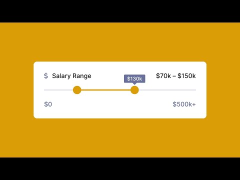
How to Hack a Slider with Auto-Layout
Auto Layout chat bubble components for FigJam
“In this Figma Tip, we create an Auto Layout chat bubble to be used in FigJam. Chat bubbles outlined in this tip and some additional Auto Layout notecards can be downloaded and reused from a community file.”
Using Auto Layout to make a table
Over a year ago I made a 56(?!) second video on how to make a table using auto layout. Since then Figma has released a ton of amazing updates, like variants! Here's a 55 second video on a simple way to make a table with auto layout and variants pic.twitter.com/nZ33gPqSzq
— Figma:55 (@figma55) June 16, 2021
Figma tutorial: Auto Layout review card iterations
Placing objects over Auto Layout frames
Reverse layers order in Auto Layout
🔥 Hot #FigmaTip: using 180° rotation to change layers order in @figmadesign Auto Layout. pic.twitter.com/XTvq2QsB5S
— Eugene Fedorenko 🇺🇦 (@efedorenko) April 27, 2021


