#Luis Ouriach
shadcn Figma kit
Luis Ouriach released a free shadcn/ui Figma kit, including Tailwind colors, semantic light/dark colors, typographic variables and styles, effects, components, example pages, and space utility variables. If you’re curious how it was made, Luis documented every step of the process, starting back in September of last year.
Variants, nesting, and component performance in Figma
Luis measures and compares the performance of a complex component built as a single mega-variant vs. nested and bubbled instances. While the nested instance approach is faster and more maintainable, he shares a few alternatives that are worth considering.
Deep dive into Figma’s UI kit: Simple Design System with Luis
Luis and Molly discuss how every small and large decision was made in Figma’s Simple Design System.

Loose thoughts: Variables considerations for multi-faceted systems
Luis Ouriach: “If you’re working in a team with either multiple brands, multiple platforms, multiple densities, or perhaps all of the above you may be stuck trying to figure out how to structure your system/s in Figma. Here are some loose thoughts on how I’d go about approaching the problem.”
Some loose thoughts on versioning in Figma
I love when Luis gets down to the nitty-gritty of the mundane daily challenges: “If my team needs to ship a feature that uses version 1, and your team needs to support version 2 because you’re releasing much further in the future, how do we manage that with a single component in a single library? As soon as we update the component to version 2 in our library and hit the publish button, every single designer is grandfathered into the newest version. This should be sending alarm bells to us all! We need the ability to maintain two separate versions of the same component, but unfortunately this isn’t possible within Figma yet. As a result, we need to think laterally to figure out a solution for all.”
He makes so many good points: “Centrally though, I believe we should strive for a world where design files are throwaway deliverables, versus an ongoing “forever file” that’s constantly updated.”
In the file: Building a business case for accessibility
Luis Ouriach: “No one can deny the importance of accessibility, but successfully embedding accessibility into the heart of a business is no simple task. So where do you start?”
In the file: From code to design to code
It was a great episode of the “In the File” series, where Luis Ouriach talks to the designer Yann-Edern Gillet and engineer Andreas Eldh from Linear about the recent update of their design system. I love their use of the LCH color space to generate a consistent palette and tight collaboration between design and engineering.

Styles or variables, which one goes where?
Luis shows where styles and variables can be used in the Figma UI.
Typography variables advice
Luis on the power of efficient aliasing when building typographic styles from primitives.
Icon bounding boxes
Luis brings up an interesting point about optical spacing and bounding boxes of icons. That’s been bugging me as well, but I don’t think there is a universal solution besides creating two sets of icons for vertical and horizontal alignment, which feels like an overkill for most systems.
Simple Design System
A base UI kit from Advocates Luis and Jake is available in the Figma assets panel by default. It’s backed with a fully Code Connected React codebase. See Luis’ thread on how and why it was made.
My First Variable: Typography variables
A new video in Luis Ouriach’s “My First Variable” series on the typography support within variables. He explains using string and number variables to set font weights, combining weights with styles such as italics, grouping text variables, aliasing font families, naming conventions, and more.

Change pages in bulk
That’s not all! Now, you can also select multiple pages by holding Shift to rename, delete, or move them in bulk.
Typography variables: System fonts boilerplate
Luis built a starter kit for system font stacks with 123 variables, including numbers and strings for font weights in CSS, SF Pro, Segoe UI, and Roboto fonts.
Typography variables starter kit
A starter kit from Luis Ouriach shows how to set things up with typographic variables.
Guide: Component naming manifesto
Luis shared a set of recommendations on how to approach naming conventions for components, props, and values within Figma component libraries.
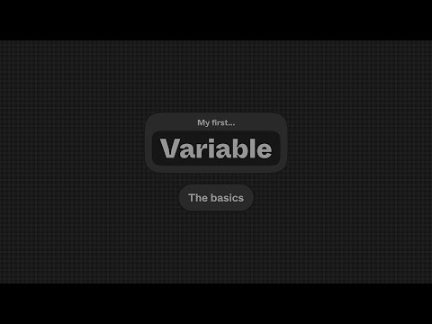
My First Variable
The new video series from Luis Ouriach on variables. The first part introduces the basic concepts and terminology — variable types, collections, modes, and aliases. The second part is “The 3 levels of variable” where Luis explains the definitions of primitive, semantic, and component-level variables. The third part focuses on creating your first variables and using modes to manage theming and densities.
Techchat with Luis Ouriach
In this episode of the “Tech Chat” podcast, Luis shares his journey, shedding light on how he found his path to Figma and what it’s like to serve as a design advocate.
Are we too pedantic with semantics?
Luis wonders whether variables scoping provides enough semantic modification to justify removing explicit “background”, “border”, and “text” color variables. “What’s stopping us from maintaining a single, primitive set of variables, named as such (e.g. red-300) to match your developer’s framework, relying on scoping alone to bridge this gap?” (See the discussion in this thread on X.)
I also like this take from Nate Baldwin — primitive color palettes are inherently semantic because every lightness stop is knowingly created to be used for specific use cases. He supports this idea with examples from his work on Adobe’s Spectrum color palette.
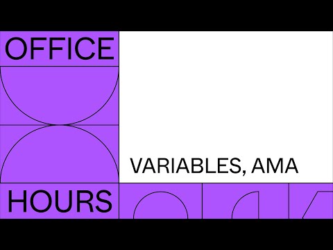
Office hours: Variables, AMA
The Designer Advocate team recently hosted another Office Hours AMA focused on the use of variables in Figma. Watch Lauren Andres, Luis Ouriach, Chad Bergman, and Shana Hu discuss nested instance variant binding, applying boolean variables, and a few related questions.