Little Big Updates. APCA. Memory usage.
Sponsor
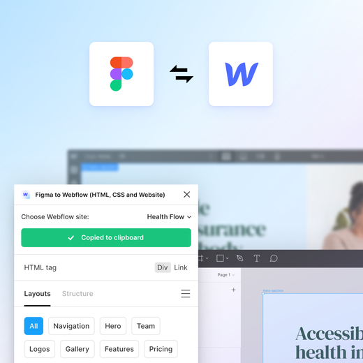
Go from Figma to Webflow, faster
Copy, paste, polish, publish. Design with auto layout in Figma, then easily translate your designs to Webflow as responsive flexbox structures — and adjust HTML tags within Figma to get your site live faster.
App Updates
Little Big Updates Week 1: Assets panel improvements
A new take on Little Big Updates from Figma — every Thursday this fall they’re releasing some of the 30+ updates designed to make day-to-day life a little easier. This week it’s four improvements to the Assets panel. #1 is filtering assets by a specific library file, recently viewed, default libraries, and more. #2 is larger and more visible thumbnails. #3 is showing component names by default, with variant counts on hover. #4 is my favorite — clicking on an asset opens up a new component modal that displays a larger preview and a link to the main component file, plus a component playground on the paid plans where you can preview and interact with any variants, variable modes, or component properties.
Recovery out of memory files with Recovery Mode
In Recovery Mode, you temporarily regain access to the file and can take limited actions to reduce content and restore edit access. Once you have reduced file memory below 90%, you can exit recovery mode and regain full edit access to your file.
What’s New
Design tool memory usage
Bjango, the maker of the popular apps iStat Menus and Snowflake, tests how various design tools utilize memory, what’s their baseline usage with no documents open, and how memory grows with lots of large documents open. Not surprisingly, Figma has the highest memory usage as an Electron app. “I believe Figma loads a full copy of the application per tab, which may be part of the cause for its high memory usage. Each tab is also limited to 2GB of RAM, leaving around 1.75 GB for the largest possible document. Put another way, if you purchased a Mac Studio with 192 GB of RAM, you could only open documents that use less than 1% of it. This is different from the other applications tested, which have access to the Mac Studio’s full 192 GB, minus whatever the system is using. Figma simultaneously uses the most overall memory of all the tools tested, while also being the most constrained.”
The Realities And Myths Of Contrast And Color
Somehow I missed that deep dive into color theory, perception of contrast, and human physiology by Andrew Somers, author of APCA and a co-author of the future WCAG 3 accessibility guidelines. “This new method directly considers perceptual lightness/darkness differences of text against a background, and generates a “lightness contrast” value, noted as Lc. From here, we can determine the minimum size and weight of a font that is going to be fluently readable, and together these calculated predictions can guide our design choices.” He provides some practical guidelines for the transitional period, where we know that existing guidelines are expected to be revised or replaced. (Worth mentioning that my tool Accessible Palette supports both WCAG 2 and APCA contrast algorithms. Also, see the new Polychrom plugin below.)
Using Figma
Swap libraries and variable modes
Luis shows that if your styles have multi-mode variables as their values, Swap Libraries still works for managing theme swapping in a multi-brand setup.
Switch between pixels and rem units in Dev Mode
Molly with step-by-step instructions for using rem units in your text properties. The developers on your team will be grateful for using the same units as they do when it comes to the handoff time!
Helpful gradient tips
A few good tips on adjusting the color hue, opacity, and evenly distributing color handles.
Plugins
 Polychrom
An early beta of a new APCA contrast checker plugin from my friends at Evil Martians. Polychrom displays the contrast level between the selection and an automatically detected layer background or two selected layers with solid fills. It also offers text size recommendations for regular and bold font styles, following the APCA contrast-to-font table. Earlier this year I was looking for an APCA contrast checker to recommend in my Config talk and found all existing options lacking, so really happy to see this team building it!
 Perceptual Color
New plugin for working with perceptual color and OKLCH color space! This initial release allows inspecting and manipulating color stops in gradients using the OKLCH color space — pretty useful if you have an existing gradient that needs a little tweaking. Bonus point for providing precise control over color stop positions!
Resources
Microsoft Fluent 2 Web
The brand new kit with the evolution of Microsoft’s design system. Supports variables, theme switching, and uses memory more efficiently.
Backstage
An inside look at Figma’s unique GTM motion
Lenny’s newsletter and podcast are my favorite on all things product and growth, so I’m looking forward to listening to this interview! “Claire Butler was Figma’s first GTM hire and their 10th employee. She led Figma’s early GTM strategy from stealth through monetization. She also helped the team through the journey to find product-market fit and built the team that drove Figma’s unique bottom-up growth motion. Eight years later, as Senior Director of Marketing, she continues to lead Figma’s bottom-up growth motion, along with community, events, social, advocacy, and Figma for education.”

