#Features
Getting started with Slots
How to Supercharge your Design System with Slots
Create multiple component mappings in Code Connect UI
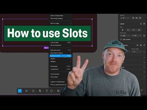
Create flexible components with Slots
Slots are finally here! This hands-on tutorial explains building flexible components with Slots and covers the practical workflow, from setting up a slot inside a component to configuring preferred instances so designers know exactly what content belongs there.
It’s time to pay respect to the original “slot component” technique, shared by Ridd back in 2021. Thanks for your service, you’ve served us well.

 Streaming
Cole Derochie from Shopify made a plugin for simulating an LLM streaming experience — make sure to check out the demo.
Inline search for library colors
You can now type directly in the hex code input to access your color variables and styles. Lots of smart details: enter a hex value and see all variables and styles using it, colors are surfaced based on the context, and related terms are baked into the new algorithm (i.e., finding your “danger” variable when searching for “error”).
We just released a new @figma feature I’ve been working on for a while now: inline search for library colors! You can now type directly in the hex code input to access your color variables and styles.
— Billy Sweeney (@billy_sweeney) February 25, 2026
It’s starting to rollout now, let us know what you think! pic.twitter.com/syPN3d0NGc
Release Notes, February Edition
A live walkthrough of all February launches across Figma products, plus a Q&A with CPO Yuhki Yamashita on where design and software are headed this year. Don’t miss an early preview of Slots, launching in open beta this Thursday.
Variables for brand designers
Mallory breaks down how brand designers can use variables to scale brand expression in Figma. Learn what variables are, how they differ from styles, and how they support real brand use cases — from multi-brand systems to scalable templates.

Faster tab navigation on the desktop app
The new tab menu replaces the three dot menu to make it easier to find and manage open files when your tab bar fills up.
User groups are now available
You can now bulk share resources like files and projects with user groups.
 CMYK Halftone
A cool plugin by Daniel Petho simulating traditional CMYK halftone printing by generating and overlaying separate cyan, magenta, yellow, and black halftone dot screens, with adjustable colors, dot size, frequency, and imperfections.
Vector point box transform
Miggi presents the new vector point box transform controls, letting you resize selections of vector points as a box instead of nudging each point manually. This makes symmetry tweaks and proportional adjustments much faster and fills a gap in Figma’s otherwise excellent vector tooling. It’s the kind of unsexy but high‑leverage improvement that will matter more the deeper you are in vector-heavy files.
Been requesting vector point box transform functionality at @figma for years. So stoked it's now here! Have more control over symmetry and relative resizing of vector points in your design workflow. #FigmaTip pic.twitter.com/vXpcBmlFWc
— miggi from figgi (@miggi) February 4, 2026
For the love of craft: Vectorize images in Figma
Rogie King introduces Vectorize, a new AI-powered action in Figma Design and Draw that converts any raster image into fully editable vectors in one click. This feature finally removes the need to use 3rd-party plugins or to redraw assets, while still letting you tweak paths, use color variables, and turn “messy” starting points into reusable components.
How a UX researcher uses Figma Make at GM
In this interview, Jay Dalal chats with Laura Dunn, Head of Design Research for the GM Human Interface Design Team. You will learn how Laura uses Figma Make as a UX researcher to communicate visually with designers.

New iPhone 17 device frames
New device frames are now available for the latest iPhone 17 and Air models.
Getting started with Figma’s Glass effect updates
The Glass effect is now generally available, and Miggi introduces a few updates: add Glass to any object, shape, or text; design Glass with non-uniform corners and precisely round each corner radius; use the Splay property to control how light bends around an object’s edges; and apply variables to Glass properties to easily connect to your design system.

More new features in Figma Make
“These updates give you more precision and control when bringing ideas to life in Figma Make: preview a to-do list for your more complex prompts so you can see, verify, and even edit the plan before it runs; manually edit text or delete specific elements to quickly fine-tune your prototypes; and a new navigation bar where you can route to a specific screen of your prototype.”
Going back to local again
Doruk: “Photoshop to Sketch was a productivity jump. Sketch to Figma was a collaboration jump. This next jump will be the same type of collaboration leap, but for coded prototypes. This is not “designers can code now”. It is about keeping design work shareable and close to production. The teams that win will not be the ones with the fanciest local setups. They will be the ones who keep making, testing, and reviewing work in the same shared space.”
That line hit me:
— Doruk (@dorukkavcioglu) January 20, 2026
“Transitioning from Sketch to Figma was a no brainer because all of a sudden we went from working in local files to web based collaboration”
People frame the current moment as “designers will code now”. I think the bigger story is simpler.
We are quietly… https://t.co/7ktBP0SjAD
How I Think About Starting With Variables
Joey Banks shares a simple way to get started with variables structure when he is not sure where to begin: “One very simple approach that’s worked well for me is separating variables into non-interactive and interactive buckets. […] Non-interactive variables describe the environment. Things like background surfaces, text, icons, and borders that don’t change based on input. Interactive variables describe behavior, such as actions, states, and feedback that do respond to input.”
A Living Manual for Better Interfaces
A collection of essays by Raphael Salaja on interaction design and animations.