#Features
Test Make prototypes on mobile
Makes now run natively on the Figma mobile app for on-device testing and touch interaction previews. Mobile creation and editing is coming soon.
You can now test your @figma Makes more naturally as a mobile experience without publishing... it just *Makes* sense! 💫 pic.twitter.com/J5GHN6ufRc
— miggi from figma (@miggi) April 22, 2026
Pica – Font Manager for macOS
Pica is a native macOS font manager from Josh Puckett, built for designers who want proper font organization. “Organize into collections, test color themes and logos, watch folders, manage what’s installed, and much more.”
Your workflow is now faster
Figma ships a meaningful performance update across the board: 10x faster vector editing, 4x smoother Make frame rates, faster load times, 92% fewer memory warnings. Just the memory side of this update was six months in the making!
Made some improvements to make your workflows faster. Like a lot faster.
— Figma (@figma) April 22, 2026
→ Vector editing up to 10x faster
→ Make frame rates 4x smoother
→ Faster load times
→ 92% fewer memory warnings pic.twitter.com/O5f8lLs6O0
Swap Instance vs. Slots
Off the back of the Slots livestream last week with @dotdude, i've been trying to find a way to better articulate the distinction between Swap Instance vs. Slots.
— Hugo Raymond (@shallowveneer) April 13, 2026
They can often look like they solve the same problem, when they don't. Here's some thoughts one how to tell them…
Sample colors anywhere on your screen
On-canvas video playback in Figma Design and Figma Draw
Moodboard 3000 (Beta)
How to choose fonts for dense developer tool UIs
Unifora
Yep! Type Foundry introduces Unifora, a uniwidth variable sans-serif superfamily. If you aren’t familiar with uniwidth typefaces, it’s worth checking out details of this project. Two years dedicated to a single constraint: every weight, every width, every slant — same character widths. This solves a real problem for interface designers: text that doesn’t reflow when you switch from regular to bold.
I spent 2 years on a single constraint: every weight, every width, every slant—same character widths.
— Yep! Type Foundry (@yeptype) April 8, 2026
Today Unifora is out.
A uniwidth variable sans-serif superfamily. 135 fonts. Industrial edge, architectural precision. pic.twitter.com/yzJizpnEdi
State of Prototyping: Spring 2026
Emil Kowalski skill
Purchase and manage additional AI credits
Introducing Apps in Figma Community
Prototype Code Is Not Production Code (And That's Okay)
Patrick Morgan makes a clean distinction that vibe-coding discourse keeps blurring: prototype code is for exploration, production code is for endurance. He is building a protected prototyping environment using Claude Code, a place where his team can move fast and then deliberately port the right assets across the boundary into production.
There is a clear parallel with how the design team at Notion works. In the recent episode of How I AI, Brian Lovin showed their collaborative “prototype playground,” where the entire team can create, share, and iterate on functional prototypes.
That also reminded me of how my team worked a decade ago, back when front-end development was a tad simpler. We had a separate “mockups” directory inside the Rails monorepo, where designers prepared static HTML mockups with production-ready CSS and JS. By the time designs were handed off to engineers in a feature branch, all polish and design details were already baked in. The design team must be fairly technical, but there is no going back to handing off Figma files after working this way.
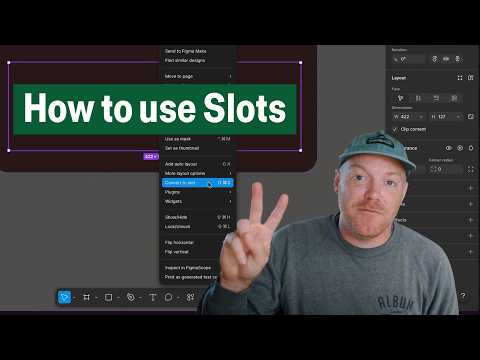
Create flexible components with Slots
Slots are finally here! This hands-on tutorial explains building flexible components with Slots and covers the practical workflow, from setting up a slot inside a component to configuring preferred instances so designers know exactly what content belongs there.
It’s time to pay respect to the original “slot component” technique, shared by Ridd back in 2021. Thanks for your service, you’ve served us well.
Getting started with Slots
How to Supercharge your Design System with Slots
Create multiple component mappings in Code Connect UI
 Streaming
Cole Derochie from Shopify made a plugin for simulating an LLM streaming experience — make sure to check out the demo.
Inline search for library colors
You can now type directly in the hex code input to access your color variables and styles. Lots of smart details: enter a hex value and see all variables and styles using it, colors are surfaced based on the context, and related terms are baked into the new algorithm (i.e., finding your “danger” variable when searching for “error”).
We just released a new @figma feature I’ve been working on for a while now: inline search for library colors! You can now type directly in the hex code input to access your color variables and styles.
— Billy Sweeney (@billy_sweeney) February 25, 2026
It’s starting to rollout now, let us know what you think! pic.twitter.com/syPN3d0NGc


