#Components & Variants
Creating components
A new video from Figma is going back to basics — what components are, why we use them, and how to create them. See also a couple more new tips on Component properties and Variants.

Create an adjustable progress bar in Figma
Learn how to build a dual range slider that is adjustable using Auto Layout so you don’t have to create a ton of variants to show different options.

Cascading Components — A way to organize Figma component variants
In this guide, Bruno Temporim Carneiro shares a method for structuring Figma components through nesting and organizing variants. This approach allows for easy modification and updates to components.
Color-coding components
A good tip from Jan Toman on color-coding different types of components inside a Figma library, which allows everyone to identify the component’s source and set the right expectations from these components.
When using @figma libraries, we found color-coding different types of components extremely helpful.
— Jan Toman (@HonzaTmn) April 25, 2023
This allows everyone in the team to identify the component's source quickly and set the right expectations from these components.
Some tips and learnings in the thread 🧵 pic.twitter.com/FMr7kjSVBv
Debugging & refactoring a variant component
On a similar note, this thread by Luis is a great walkthrough of debugging, reducing complexity, and refactoring a tricky variant component. The core part of his approach is slicing everything up into composable parts.
Last week I was asked by someone in the Figma community to help debug and refactor their variant component
— luis. (@disco_lu) April 25, 2023
So I'm going to try and walk through how I did it! Let's see if it works as 1 million tweets 🐦
The short answer is: components everywhere pic.twitter.com/DKgjC5oNWg
Figma, I love you but you’re bringing me down
Joe Bernstein on confronting the conflict between what’s possible in Figma and what’s practical: “Ultimately, my point here is that I over-engineered this component. Figma has the capacity to be much more than a design tool, and sometimes I use it to engineer a UI. Clearly I enjoy doing that, and I even get lost in the weeds to achieve a deeply technical solution. But design systems and asset libraries are just as much a user-centered design problem as any other publicly facing product.”
Emojis in the prop names
Luis with a nifty list of suggested emojis to indicate different kinds of component properties.
I've been going deep on component properties recently, and found using emojis in the prop names really helps understand their purpose
— luis. (@disco_lu) April 19, 2023
Here's my current list:
✍️ Label
◈ Type
↔️ Size
🔁 Swap instance
📈 Data
🖱 Interaction
←️ Left toggle
→️ Right toggle
🔘 Toggle pic.twitter.com/3pWFbDCdV1
Advanced Figma Components Tips & Tricks
One more video by Christine, this time about components — covering everything from simple shortcuts to powerful plugins. Some of the topics include selecting matching layers across all variants, reviewing library updates, linking Figma components to a code base, using the EightShapes Specs plugin, moving components between files, swapping libraries, and using real data in instances.

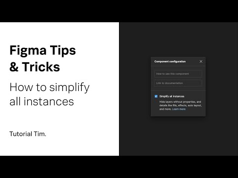
Figma Tips & Tricks: Simplify All Instances
Tutorial Tim shows how the “Simplify all Instances” feature reduces an overwhelming visual overload in the Properties panel.
Focus rings
Luis with a cool technique for adding focus rings to a button using an absolutely positioned component instead of a shadow hack.
Quick tip on creating proper focus rings on components ❖
— luis. (@disco_lu) April 4, 2023
Set up a "focus ring" component, and then use absolute positioning, combined with left/right and top/bottom constraints to make it stick to the edges
Bye bye to shadow hacks 👋 pic.twitter.com/khTfVY5IBa
Component props v2
Component properties v2 are out of beta with the ability to bubble up and expose properties of nested instances. It’s also now possible to define a list of preferred instances for swapping. Great for selecting a subset of a larger icons library or working with card components.
13/32 Component properties: exposed nested instances
— Figma (@figma) March 28, 2023
The ability to bubble up properties of nested instances is now default turned on for everyone. pic.twitter.com/YMmyySqCLN
Library update improvements
“You can now more confidently approve library updates with a visual preview of the changes and the ability to apply them to individual instances and layers.” I don’t even know how I’ve dealt with the stress of accepting library changes sight unseen in the past.
20/32 Library update improvements
— Figma (@figma) March 28, 2023
Don't forget: You can now more confidentally approve library updates with a visual preview of the changes and the ability to apply them to individual instances and layers. pic.twitter.com/CMp1ExmZjt
Structuring a good component library
Luis shares a few tips on structuring library files. He recommends optimizing variants for searching and usage rather than maintenance, and suggests this file structure: Page → Section → Variant. Also, check out his other thread on naming and splitting your library files.
We spend a lot of time talking about component structure, but the library files themselves are often ignored
— luis. (@disco_lu) February 27, 2023
So what goes into structuring a good Figma component library?
Here are a few tips, hopefully a good starting point 📈 pic.twitter.com/2zL7xk9eSx
7 things I learned the hard way updating my design system
Epic thread by Molly Hellmuth on the best practices for using property, variant, and Auto Layout features. She just rebuilt her popular UI Prep design system with the latest Figma features and learned a lot in the process.
💡Figma tips: 7 things I learned the hard way updating my 2023 design system.
— Molly Hellmuth (@molly_hellmuth) January 26, 2023
Keep reading to learn new best practices for Figma’s latest property, variant, and auto layout features!.. pic.twitter.com/IFEWBhkgNb
Testing components
Clara Ujiie came up with a simple workflow for visually testing components. (The same tutorial is available as a Twitter thread, if that’s your jam.)

Designing the new Dive website in Figma + Framer
Ridd just launched Dive with an amazing lineup of design educators. In this tutorial, he designs the new Dive website and shows how his use of components to speed up workflow in Figma, talks about visual design principles and his approach to UI design in Figma. Lastly, he shows how easy it is to go from Figma to Framer to a published website.

Improvements to library updates
Now it’s easier to track changes to components and styles. A new icon shows when styles or instances have changed, lets you accept changes for individual instances or layers, and even shows a before vs. after preview! See a quick demo by Jacob Miller.
Creating duotone icons
Ana is building off of her tip on creating nested icons that preserve color overrides, and now makes them duotone.

The Easy Way to Build Responsive Components
Joey Banks is back with a bit of advice on his new approach to using Auto Layout for building responsive components. “With my approach today, I first like to drag out an unfinished component instance and stretch it in bizarre and unexpected ways to see what happens. If I can make this component work as expected in the strangest sizes, I’ll feel confident that it’ll work for nearly all situations.”
Design System Overrides
In a short thread, Nitish Khagwal explains how instance overrides work in Figma.
Must know – @figma Design System Overrides
— Nitish Khagwal ✨ (@nitishkmrk) December 5, 2022
thread 🧵 ... pic.twitter.com/pQK87fGZyE