Brand refresh. Mainframe. Figma sues Motiff.
Sponsor
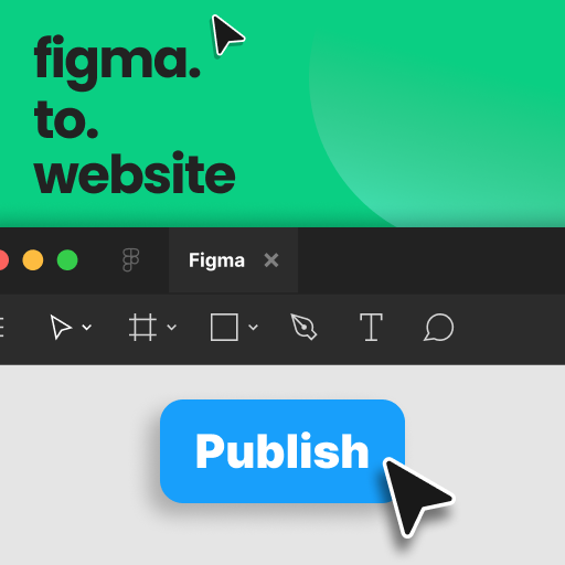
figma.to.website – Figma’s missing PUBLISH button
Design your website in Figma and hit PUBLISH to instantly get a live, fully responsive website. Free hosting and all the settings you need for SEO, custom code, embeds, analytics, forms and more.
Brand Refresh
Figma on Figma: Evolving our visual language
A deep dive into Figma’s brand refresh. “Figma’s visual identity has gotten a bold refresh. From playful primitives to a vibrant new palette, we’re unveiling our latest brand evolution — one that speaks to all product builders.”
Times Square
I love how Figma showcased the community work on a giant screen at Times Square.
An expansive and expressive brand refresh marks a more “flexible” Figma
Olivia Hingley for It’s Nice That: “Sitting at the core of the concept is a new brand idea: ‘build by design’. Short and sweet, the idea reinstates that design is more than just a skill, department or process, it’s the “gravitational centre” of the brand. Three brand beliefs come from this idea: ‘design is everyone’s business’, which speaks to the flexibility and broad nature of design, while the second, ‘craft as a differentiator’, centers on the care and attention to detail that Figma propagates. […] And, the third and final belief is ‘the idea is just the beginning’.”
Figma’s new branding is designed for growth mode
Fast Company on Figma’s rebrand: ”Today, the company is launching a refreshed visual identity that represents its growing, post-Adobe breakup ambitions to be, well, just about everything. Figma’s been making moves to expand beyond its founding idea of being being a single product company for designers, to a multi-product company for multi-role creative teams. Now, the company’s refreshed brand is catching up and speaking to an expanded audience that includes developers and supporting team members like project managers, who help bring a design deliverable to life.”
Release Notes
Refreshed macOS app logo
The desktop app on macOS now sports a refreshed app icon.
Create Figma Slides outline from FigJam
I didn’t know I needed this until I saw it. Plan the presentation in FigJam, then turn it into a deck outline in Slides: “Think it in FigJam, present it in Figma: create a Figma Slides outline from a FigJam board with a few clicks.”
Introducing Embed Kit 2.0
A note to app developers: “We’re releasing a new embed kit that gives you more control and flexibility over how you embed Figma in your website or app.”
What’s New
Why is it cool to hate on design systems?
Ridd argues that the pendulum has swung too far, and designers hating on design systems are missing the point. You might not need an enterprise-grade system with all bells and whistles, but every product can benefit from a set of simple components: “I’ll suggest design systems are most valuable when you DON’T know what the product will be… Investing in a set of core components minimizes the number of knobs you need to turn in order to iterate.”
How I design a website for a client
In this video, Ridd shares the behind-the-scenes process of redesigning a website for Genway, from generating and exploring new ideas to skipping wireframing and going straight to high-fidelity work to progressively presenting ideas to stakeholders.
Design Systems That Spark Joy: Rethinking Layout For Scalability
Maria Christopher from Uber, on the challenges of managing a growing design system: “Over time, we struggled with component redundancy and system inconsistency. The increasing complexity from the sheer amount of components, variants, and customizations began to undermine the effectiveness and integrity of our system. It turns out, we weren’t alone. This mirrors a broader trend in the design industry, where the focus is shifting towards critically evaluating and simplifying systems, rather than just adding more layers of complexity.”
Mainframe
Weeks after leaving Figma, Jordan Singer introduced Mainframe, “a future operating system with AI as the default”.
(Made me think of Playbit, started by Rasmus Andersson a few years ago. What’s up with ex-Figma designers starting operating systems?!)
Plugins
Supa Palette 4.0
I look forward to the next release of Supa Palette with support for OKLCH and reusable configs!
 CSS color-mix()
Jake made a plugin that brings the power of CSS color-mix() into Figma. Use it to generate swatches, variable ramps, and solid or gradient fills. I highly recommend watching Jake’s video if you’re unfamiliar with this CSS notation.
Resources
Legacy iOS UI Kit
For those of us missing the good old days of iOS 6 and Corinthian leather: “Relive the golden era of skeuomorphic design with the Legacy iOS UI Kit.”
Simple Icons
There are plenty of icon sets out there, but this one includes 3,198 free SVG icons for popular brands, which is pretty uncommon.
Cool Thing
Deceptive Patterns
This website does a great public service by classifying dark UI patterns, pointing to relevant international laws, and publicly shaming the biggest offenders: “Deceptive patterns (also known as “dark patterns”) are tricks used in websites and apps that make you do things that you didn’t mean to, like buying or signing up for something. […] We’ve collected over 400 examples in our hall of shame. The most commonly complained about companies are Google, Facebook, Amazon and LinkedIn.”
Backstage
Figma Sues Motiff, Accusing It of Stealing Design Software Code
“Collaborative-design software maker Figma Inc. accused competitors of breaching a contract and copyright infringement by stealing its source code. Singapore-based Motiff Pte. Ltd., along with Chinese companies Yuanfudao HK Ltd. and Kanyun Holding Group Co., accessed Figma’s product under a subscription agreement and reverse engineered its copyrighted code for their own product in violation of Figma’s Master Subscription Agreement, according to a complaint filed Monday in the US District Court for the Northern District of California.“
The court document includes a fascinating list of examples.

